MyCaptain Learning Canvas (Ongoing)
Driving with Gamification

Client
MyCaptain
Services
Design Manager Lead Designer
Industries
Edtech
Date
January 2023

Results
60% of testing users reported increased motivation to complete courses with the redesigned LMS.
70% of testing users planned to spend more time on the platform with the new gamification features.
80% of testing users found the redesigned LMS more intuitive and user-friendly, making navigation easier.
90% of testing users felt more engaged with the learning content due to interactive elements.
100% of testing users were more satisfied with their learning experience on the redesigned LMS.
Research
We conducted 40+ user interviews with learners from diverse courses at MyCaptain to gather insights about their experiences with the current LMS. Here's what they shared:
"Navigating courses and finding learning materials is challenging. It's difficult to remember where I left off."
"The learning process feels monotonous without interactive elements. I miss the competitive spirit of a traditional classroom."
"The user interface is outdated and not intuitive. It's confusing to locate specific features."
"The absence of a progress tracking system makes it hard to gauge my course completion."
"There's no easy way to interact with other learners or discuss course materials. I feel isolated in my learning."
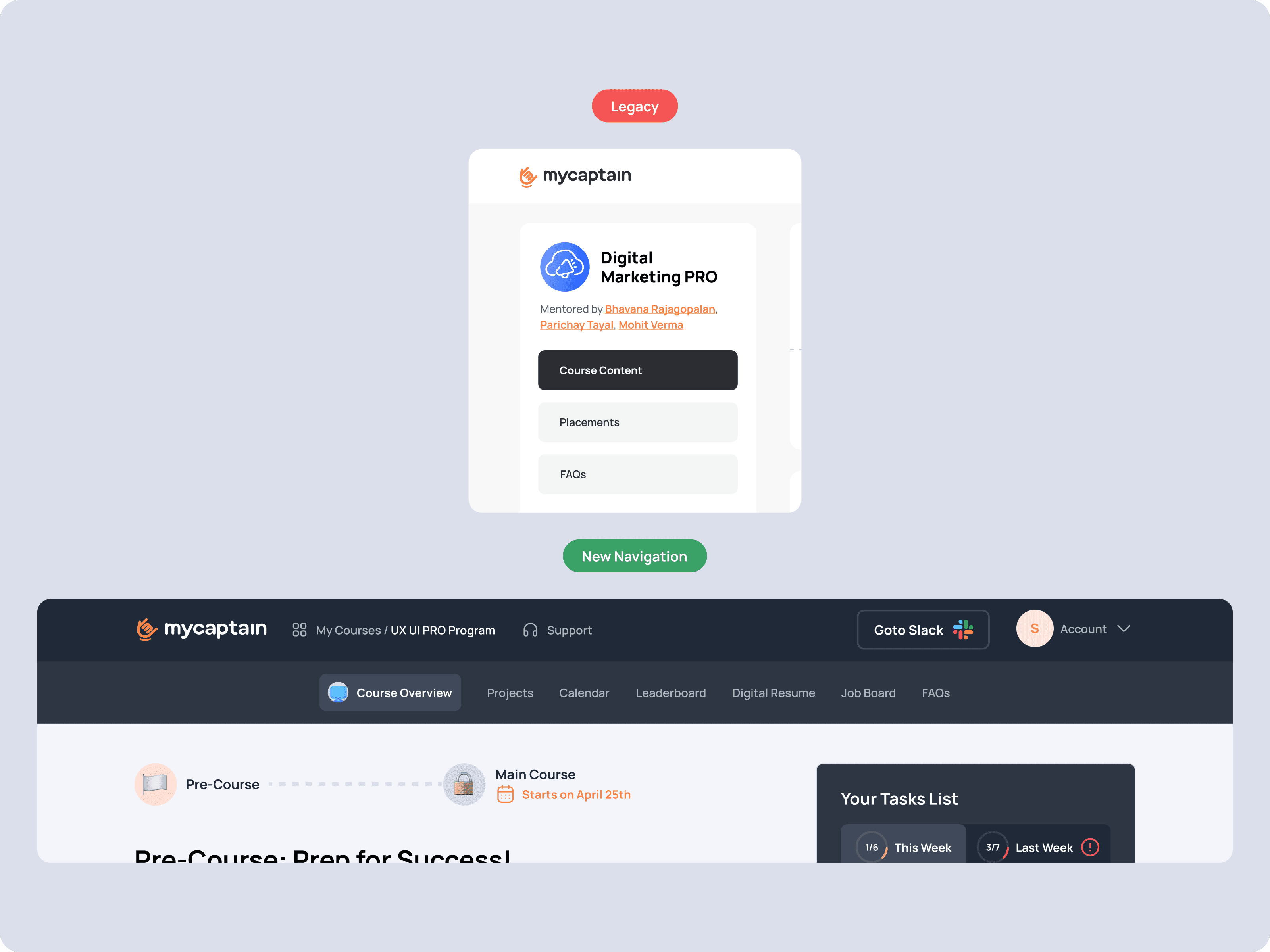
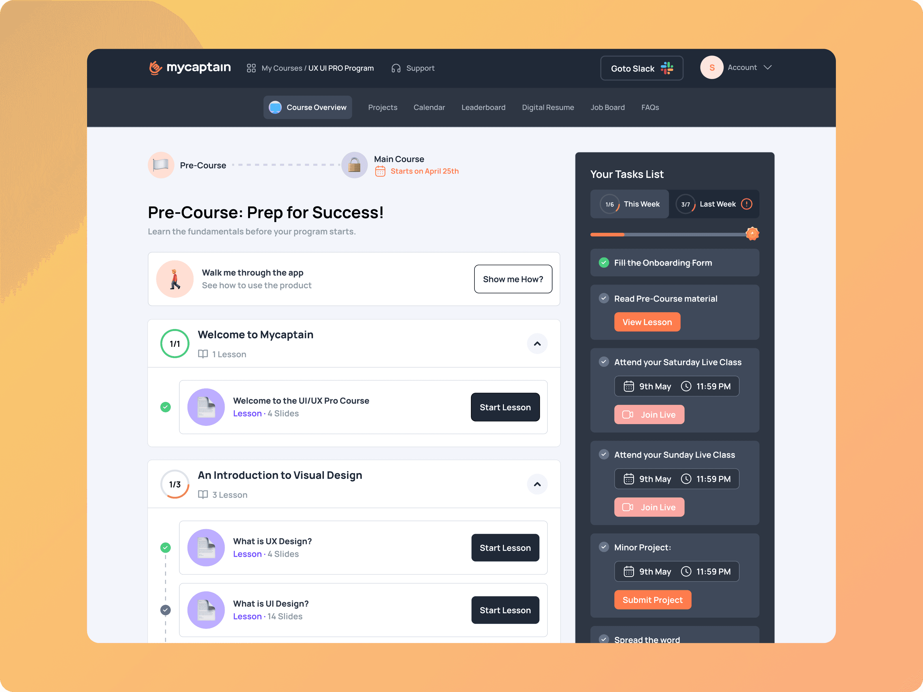
Goal 1: Better Navigation
Users found it difficult to navigate through the platform and locate specific learning materials. To address this, we aimed to improve the navigation bar for more intuitive access to different sections of the LMS.
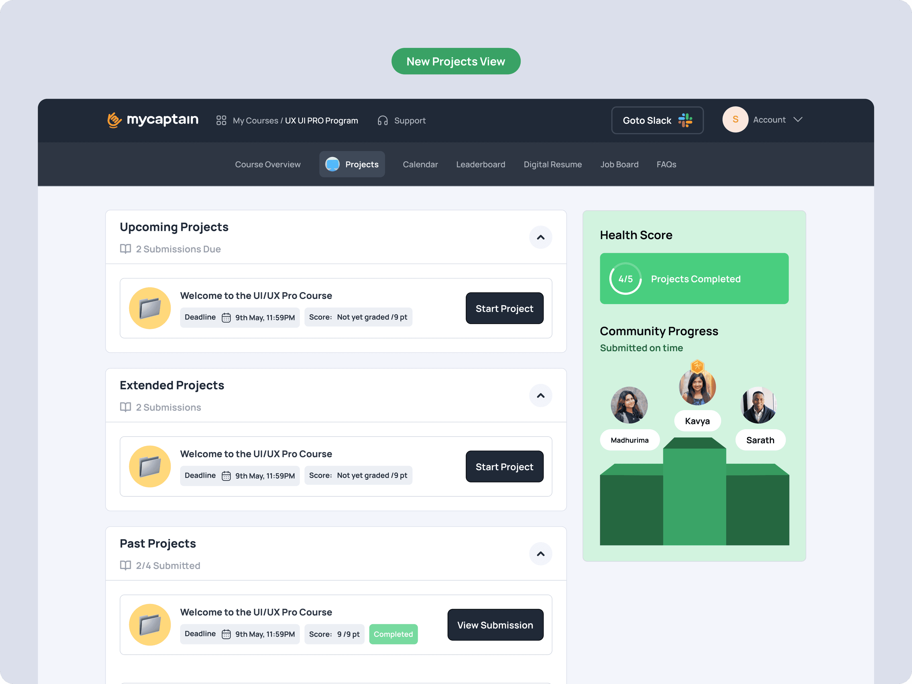
Additionally, we decided to introduce a separate page for 'Projects', making it easier for users to find and manage their project work.
Ideation:
To improve navigation, we brainstormed several options for how we could structure the LMS. Option 1 was to keep the current structure but improve the navigation bar. Option 2 was to introduce a sidebar for navigation. Option 3 was to introduce a separate 'Projects' page. Option 4 was to use a dropdown menu for navigation.
After some deliberation, we decided to eliminate Option 4, as we found that it was harder to navigate using a dropdown menu compared to a navigation bar or sidebar. Furthermore, the dropdown menu took up a lot of screen space, making it less scalable.
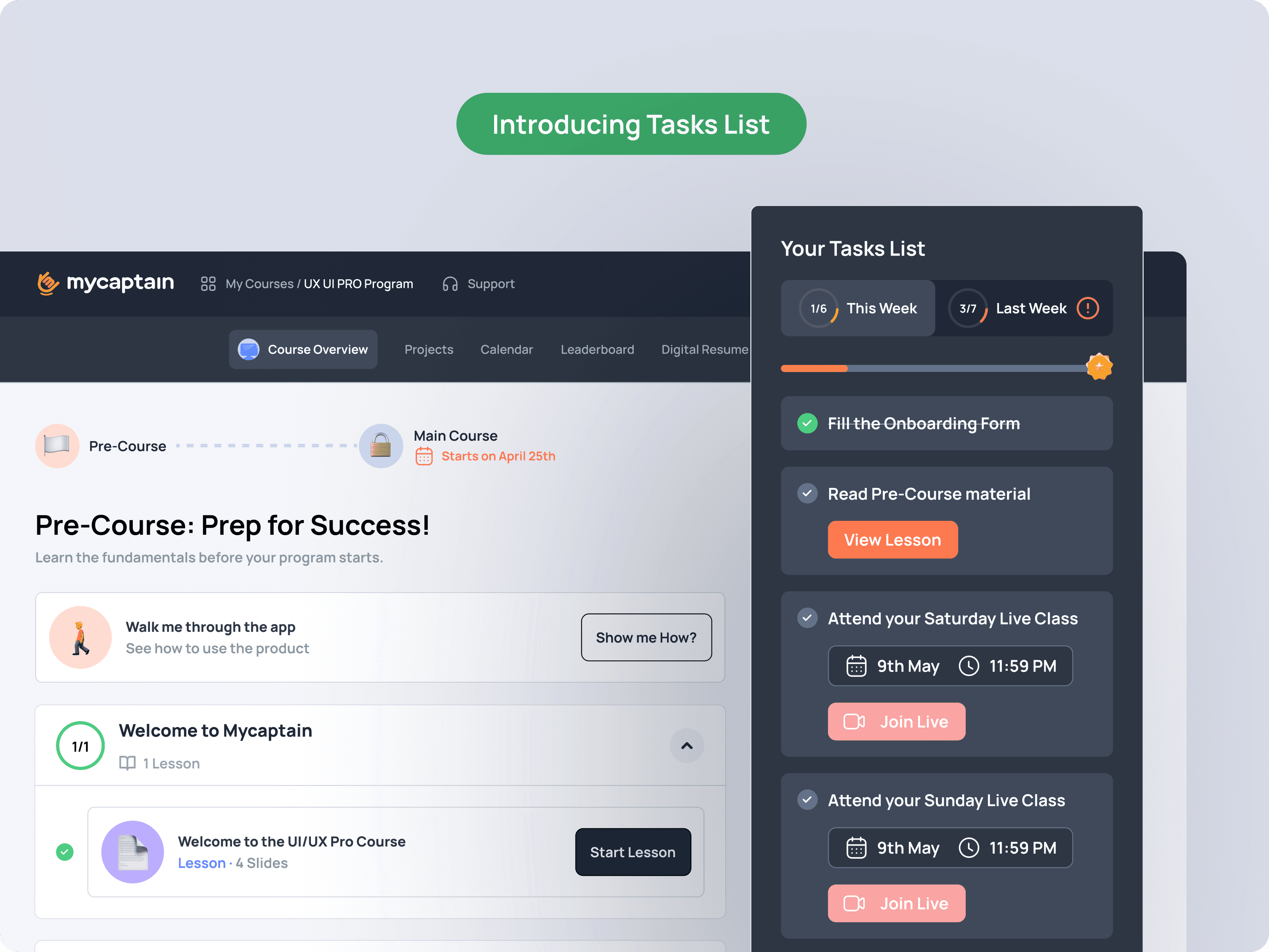
Goal 2: Driving Better Engagement
The current notice board style layout was not engaging enough for users. We decided to switch to a list view, which would present information in a more organized and digestible manner, thereby driving better engagement.

Ideation:
To improve navigation, we brainstormed several options for how we could structure the LMS. Option 1 was to keep the current structure but improve the navigation bar. Option 2 was to introduce a sidebar for navigation. Option 3 was to introduce a separate 'Projects' page. Option 4 was to use a dropdown menu for navigation.
After some deliberation, we decided to eliminate Option 4, as we found that it was harder to navigate using a dropdown menu compared to a navigation bar or sidebar. Furthermore, the dropdown menu took up a lot of screen space, making it less scalable.
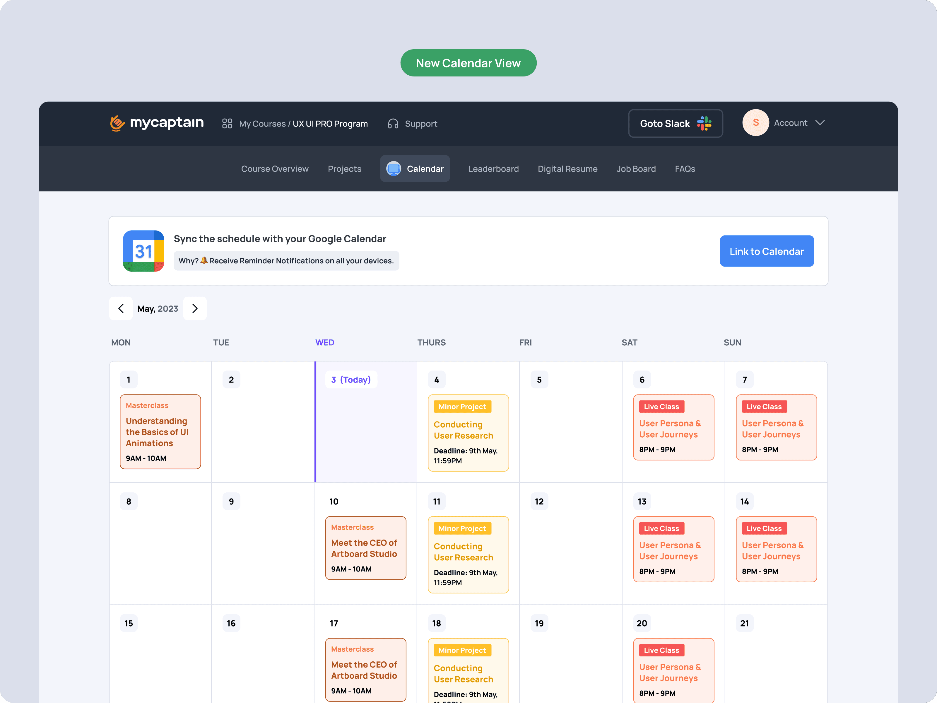
Goal 3: Better Track of the Program
Users found it hard to track their progress and understand their learning journey in the program. To solve this, we planned to replace the generic course journey with a calendar view. This would provide users with a clear visual representation of their progress and upcoming tasks, helping them manage their time and expectations better.
Ideation:
To help users better understand their program, we considered several options for presenting the course journey. Option 1 was to improve the current course journey with more details. Option 2 was to introduce a progress bar. Option 3 was to use a calendar view. Option 4 was to use a timeline view.
After some thought, we decided to go with Option 3, the calendar view, as it provided a clear and intuitive visual representation of the user's progress and upcoming tasks.
Testing using Maze
Navigation Improvements: Participants found the new navigation bar and separate 'Projects' page to be significantly more intuitive. The average usability score for the new navigation was 8.5 out of 10, compared to 6.2 for the old navigation.
List View Engagement: Participants reported that the list view was more engaging than the notice board style. On average, participants rated their preference for the list view as 7.8 out of 10, compared to 6.0 for the notice board style.
Program Understanding: Participants found the calendar view to be much clearer and easier to use than the generic course journey. The average usability score for the calendar view was 8.7 out of 10, compared to 6.5 for the generic course journey.
Overall User Experience: Participants rated the overall user experience of the new design as 8.6 out of 10. They commented positively on the aesthetics, intuitiveness, and ease of use of the new design.
💎 Learnings
Technically, this project allowed me to explore gamification in e-learning, with features like leaderboards and weekly checklists enhancing user engagement.
More broadly, the project reinforced the value of user-centric design. The changes we made were not visually drastic, but they significantly improved the user experience. This taught me that impactful redesigns focus on solving the right problems, not just making large-scale changes.
The project also highlighted the importance of iterative design and testing, shaping my approach to future design projects.
Also super credits to my team, who are making my vision possible: Mohan (Lead Product Designer), Prashanth (Jr Product Designer)